Increased the volume of voucher purchases in the marketplace by solving UX problems
UX Design · UI Design · Prototyping · UX Research
- Company
- Nais — Poland-based HR services company, B2B SaaS provider
- Product
- Employee Appreciation Platform with a Voucher Marketplace for the CEE market, 100,000+ users
- Role
- UX/UI Designer → single design lead, working closely with development, sales and customer departments
- Platform
- Web application, mobile app (iOS & Android)
Employees could spend benefit money received from their employer in a Voucher Marketplace (6000+ items). Low user satisfaction and usability problems were hurting the platform’s cash flow — the provision on voucher sales was one of the main sources of income, and monthly revenue was decreasing.
To make things worse (from the product’s perspective), some Nais clients could reclaim funds from employees if they were not spent in time.
Empathize phase
- User interviews
- Internal workshops
- Google Analytics, Hotjar
- Internal user statistics
- User feedback
I started with understanding the users and their obstacles. In Google Analytics I reviewed user journey statistics, looking for suspicious data — e.g. high drop-off rates.
To get more information about user behavior, I reviewed marketplace heatmaps and user journey recordings in Hotjar.
I also wanted to know about problems reported by users, so I scheduled meetings with Nais Customer Support — they could also reach out to client employees with specific questions.
Nais measured user satisfaction with Delighted, so I included it in the research to find feedback attached to NPS answers.
Finally, I conducted user interviews to see whether the known problems overlapped and to gather additional insights.
What I’ve found at this stage:
Wrong user focus — existing personas targeted young users (18–25), while the real age distribution was almost even between 24–55. Design had to acknowledge different levels of tech proficiency.
User login problems — GA and Customer Support data showed account activation and login issues; many client employees had no e-mail or were not tech-savvy.
Low user satisfaction — NPS was 28, with recurring complaints about confusing fund-spending restrictions (social funds usable only for specific purchases).
Redundant features — duplicated marketplace functionalities and almost unused ones (e.g. list view switching) only increased cognitive load.
No price filter — users couldn’t list only the vouchers they could afford.
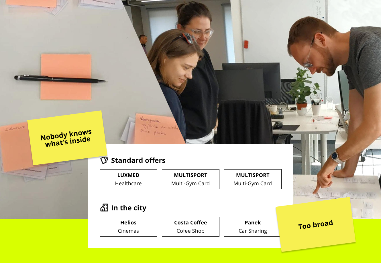
Hard category navigation — category names meant to be “exciting” were ambiguous and too broad; users struggled to place vouchers into them.
Users preferred search over browsing — the top 10 vouchers (IKEA, Spotify…) drove 80% of sales.
Some clients did little to inform employees about Nais and their available funds.
- Heuristic evaluation
- User flows review
To widen the data pool I conducted a UX audit of the whole voucher purchase process — from login to order confirmation — looking for issues users wouldn’t report and quantitative data wouldn’t show. I found over 25 problems to address.
Key findings:
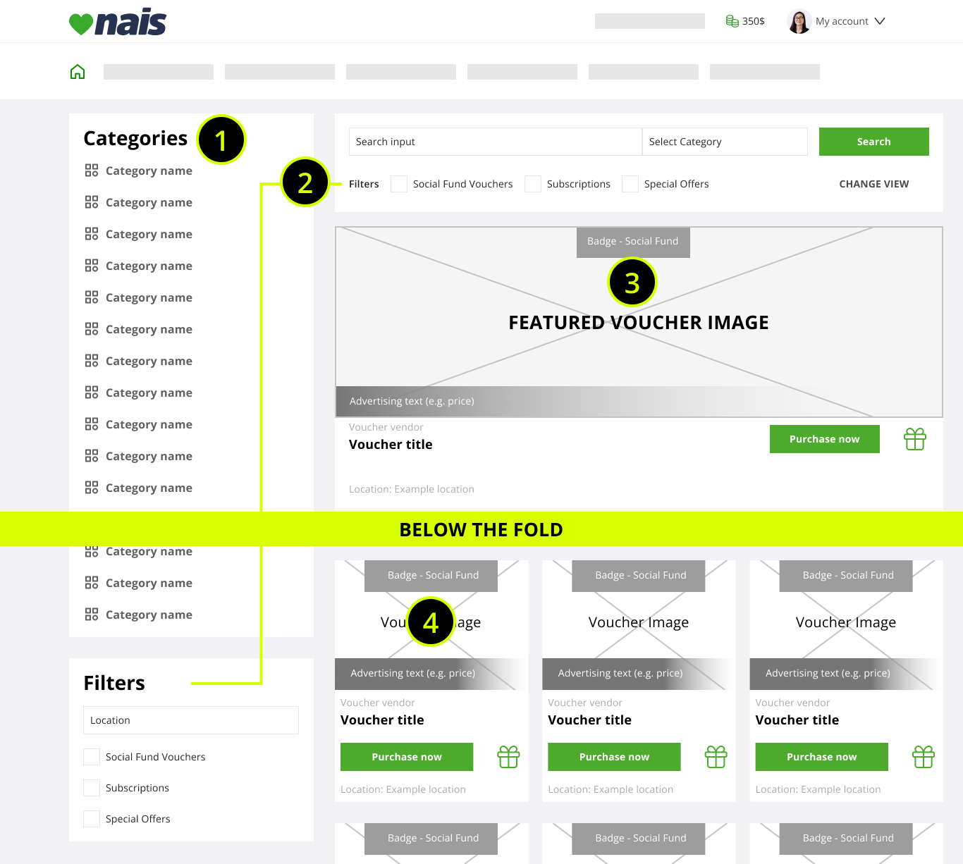
Cognitive overload on listings — the category/filter column took too much width, cramming vouchers into 3-item rows; after a short scroll the column was blank space.
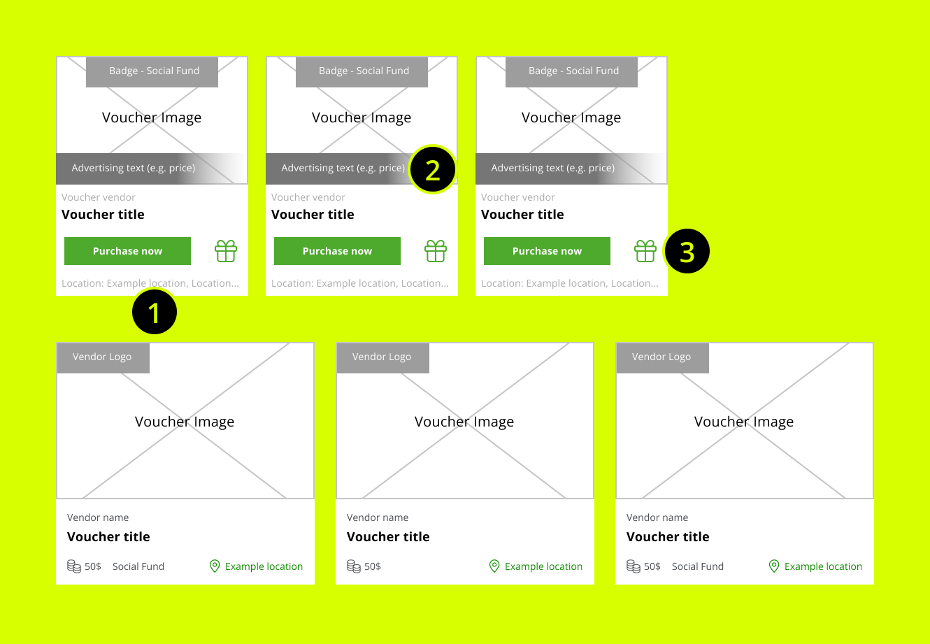
No quick scanning support — voucher details were scattered across the card; images rarely carried the provider’s logo (Netflix etc.), forcing users to read titles.
Voucher details modal with extreme load — a full-screen modal with all details and options (50+, even 60+ variants) required scrolls, broke flows and offered no direct access.
Order page UX issues — missing option details (e.g. chosen location) and awkward interactions like a 1–100 quantity dropdown.
Search inefficiency — misconfigured scoring meant ~60% of searches failed to surface the desired voucher.
Top vouchers “hidden” — uncontrolled sorting buried top-10 items under 50+ newly added provider listings.
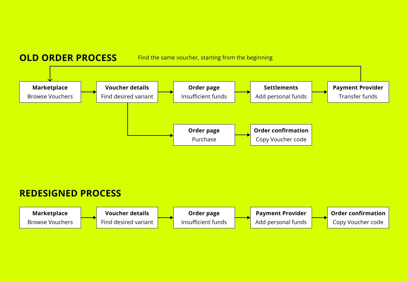
Too complex path to deposit personal funds — depositing required leaving the purchase flow for a rarely visited “Settlements” area, so most users never knew it existed.
Define & ideate
It was time to sum everything up and create problem statements that would help me and the team generate and validate ideas.
Main points to address:
The current registration and login process does not support users with low technological knowledge.
Users want to quickly find and purchase a desired voucher — current UI & back-end solutions limit that.
Some users don’t even know (or forget) they have accounts, as their employers put little effort into communication.
- Workshops
- Desk research
I explored problem solutions together with their feasibility, discussing user problems with different interest groups — stakeholders, IT, business and customer service — and involving their representatives in generating ideas.
Solutions for login & registration:
Phone number as an alternative login — users pick e-mail or SMS for registration and password reset. SMS cost per user is covered by a single marketplace purchase.
Remember user details after logout — cookies store the login, so users only re-enter their password.
Solutions:
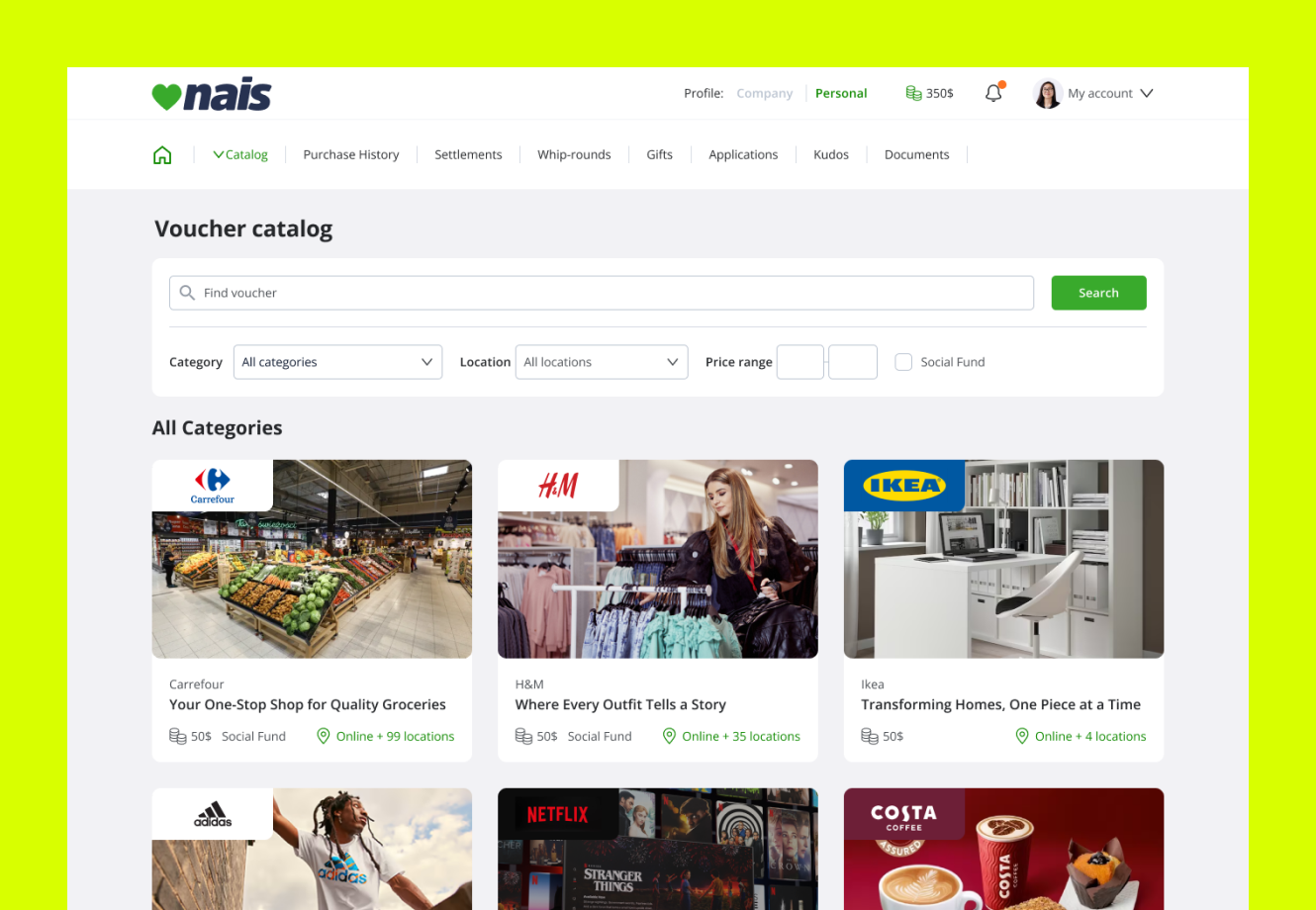
Decrease cognitive load on listings — duplicated filters removed; search, filters and category select unified in one place. Freed space stopped vouchers from being cramped, and above the fold users now see the 3 most desired items instead of one promo banner.
Improve search — I reviewed the scoring system and voucher content structure; results became accurate, and a prompting mechanism lets users jump straight to a voucher page.
Rebuild categories via card sorting — a workshop with real users grouped vendor cards into affinity groups and named them.
Improve item scanning — details consolidated in one card area, with a reserved logo spot unifying list appearance.
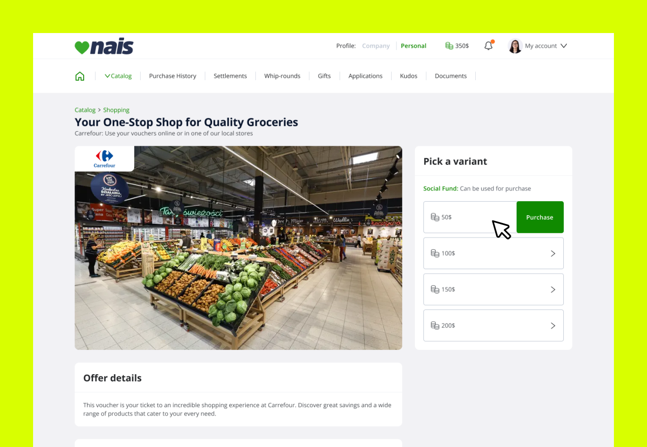
Move voucher details from modal to a standalone page — no more accidental closes, unobstructed details, better mobile responsiveness.
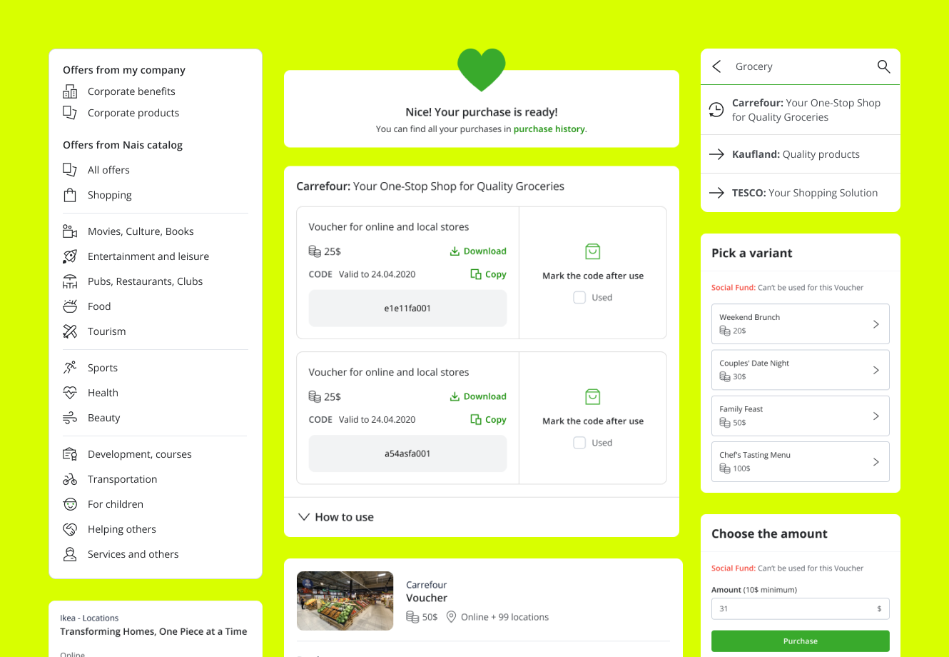
Reduce cognitive load on voucher options — with back-end devs we identified that location was the worst option type; options are now grouped by city (12 cities instead of 60+ items), lists over 10 items got quick search, and price was separated from hand-written titles.
Cover missing funds inside the flow — if balance is insufficient, the user tops up with personal funds without leaving checkout and lands on the confirmation page.
Solutions:
Educational materials for managers — instant answers to common activation questions; printed packs went to clients with the most inactive accounts.
Nais promoters on-site — educational days at client workplaces where Customer Service answered questions and helped employees register.
Validating improvements
- Figma
- Workshops
With this project I introduced interactive prototypes (Figma) at Nais, showing everyone involved in production the impact of early testing and feedback.
Before my arrival, the process was waterfall — the designer mostly produced wireframes, with no user testing before development.
By involving different people in the earlier stages, I built a shared understanding and appreciation of design thinking.
I gathered prototype feedback from internal workshops and interviews with active Nais users. Every proposed solution was positively received, with only minor tweaks reported.
Not everything could be tested pre-implementation (e.g. SMS login, promotional materials) — for those we relied on research-phase data and informed decisions.
Development & effects
- Handoff
- Project management
The list of improvements was long, so we prioritized and cut the process into phases — staying agile and leaving space to improve other parts of the platform.
With a proper design system and a priority on reusable components, I reduced general development time and worked closely with the devs for a smooth handoff.
Phase I (lower back-end involvement) — redesign the catalog and voucher details page, improve search, rebuild categories, prepare promotional materials.
Phase II — login / registration / password reset with SMS, opening the platform to all users.
Phase III — quick top-up of missing funds, involving extra payment-provider logic, so it shipped last.
The Voucher Marketplace was Nais’ main module and the only way to appreciate employees. Voucher sale provision profits were barely growing (under 5% y/y) and user satisfaction was average at best.
Due to the product’s specificity (many users save funds for Christmas), results are best compared year over year.

- 2×Voucher sales growth, year over year
- +78%NPS, from 28 to 45
- 6×GMV growth
- +30%User base growth y/y
I was the only designer (later promoted to Product Leader) at Nais for almost 3 years. In that time:
Satisfied employees built client trust — some increased their benefit budgets.
Average provision per sale fell — and that’s good. Top providers have lower reseller rates; the old strategy of pushing high-provision, low-demand vouchers was a dead end. Sales volume let Nais renegotiate terms with top providers.
There’s more when we meet.Drop me a hint what your needs are.
Tell me about your product, your users and the problem that keeps you up at night. I usually reply within 48 hours.
marek@makeux.pl