Repair the product’s design system and improve the user experience of a job searching platform
UX/UI Design · Prototyping · DesignOps
- Company
- Dryg.pl (now part of pracuj.pl)
- Product
- Job board & ATS platform
- Role
- UX/UI Designer — collaborating with the design team, QA and devs
- Platform
- Web application, mobile app (iOS & Android)
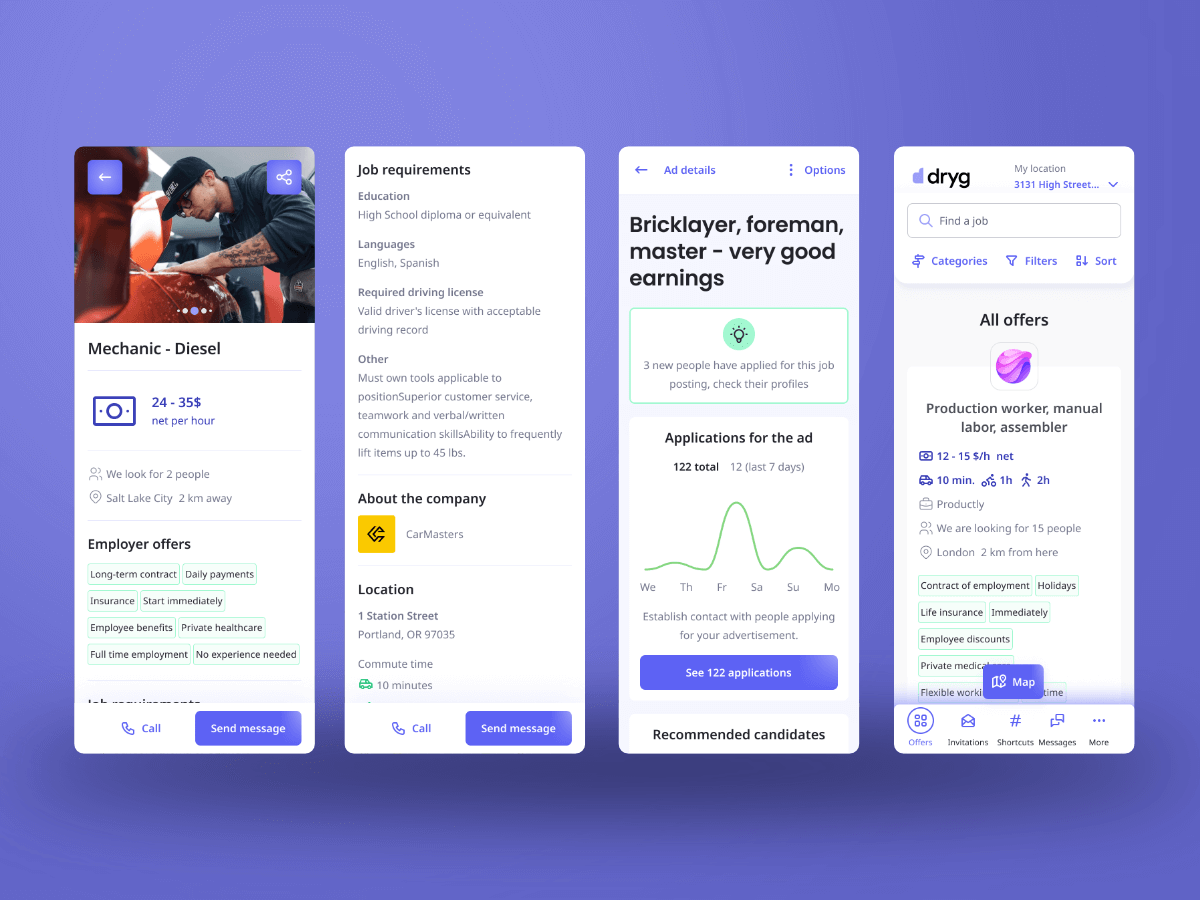
Dryg was a child product of a larger job board brand, created to explore the blue-collar market. As a constantly and rapidly evolving platform, it started to struggle with inconsistency in design and user flows — hurting both user experience and the development process.
Set the foundation
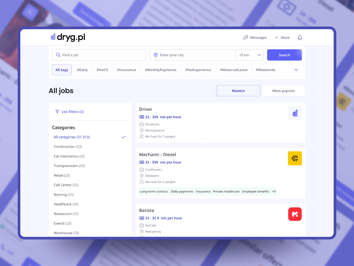
- Design system review
- Heuristic evaluation
- Usability & accessibility review
To create any solutions I had to gather all the necessary information — in two ways.
Review the existing user experience — ease of navigation (IA, user flows), accessibility and UI ease of use (WCAG compliance, UI elements), plus how well users understood the product’s copy.
Review the design files — to understand how the product and development teams operated, spot issues and find areas of improvement.
What I’ve found at this stage:
Unclear flows for two user types (employee vs employer) — dead ends and high bounce rates; the platform lacked clear paths for job seekers vs employer ATS.
Low-contrast, hard-to-read texts and too-small action elements (e.g. buttons) straining users.
Uncovered edge cases — unexpected system behavior and redundant steps in user flows.
I reviewed the design files (Figma) and other artifacts (personas, presentations) to find inconsistencies and workflow improvements.
Most problems lived in the Figma files — styleguide and wireframes used UI components from different libraries scattered across files. Grid appliance and the spacing system were inconsistent; “what is where” required the designer’s assistance.
The UI component library was incoherent and hard for developers to comprehend at handoff.
Figma’s prototype features were not used at all — making flows harder to test with users and to show developers.
With the mobile app redesign incoming, I recommended creating a proper UI component library shared between web and mobile — more consistent, faster design, and cheaper development.
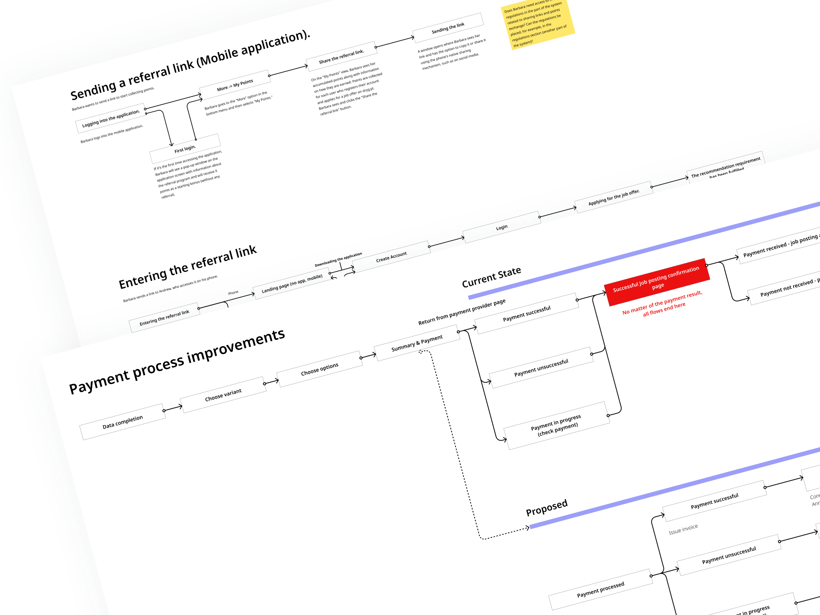
Solution space
I worked closely with the developers to reach a mutual understanding of handoff and UI construction goals. Before any UX improvements, we needed a solid foundation.
I introduced a 4px spacing system and aligned typography, icons and UI elements to it — faster placement, better layout harmony.
We replaced the naming system (colors, typography styles, UI elements and states) with a predictable one, shared between design files and code repositories.
Styleguide, UI components, wireframes and prototype moved into one collaborative file — less communication overhead, faster and more coherent development.
The design team significantly reduced the number of UI elements and used what remained to the fullest.
Finally we unified UI elements between web and mobile — with no robust client-side design team, one shared library made management realistic.
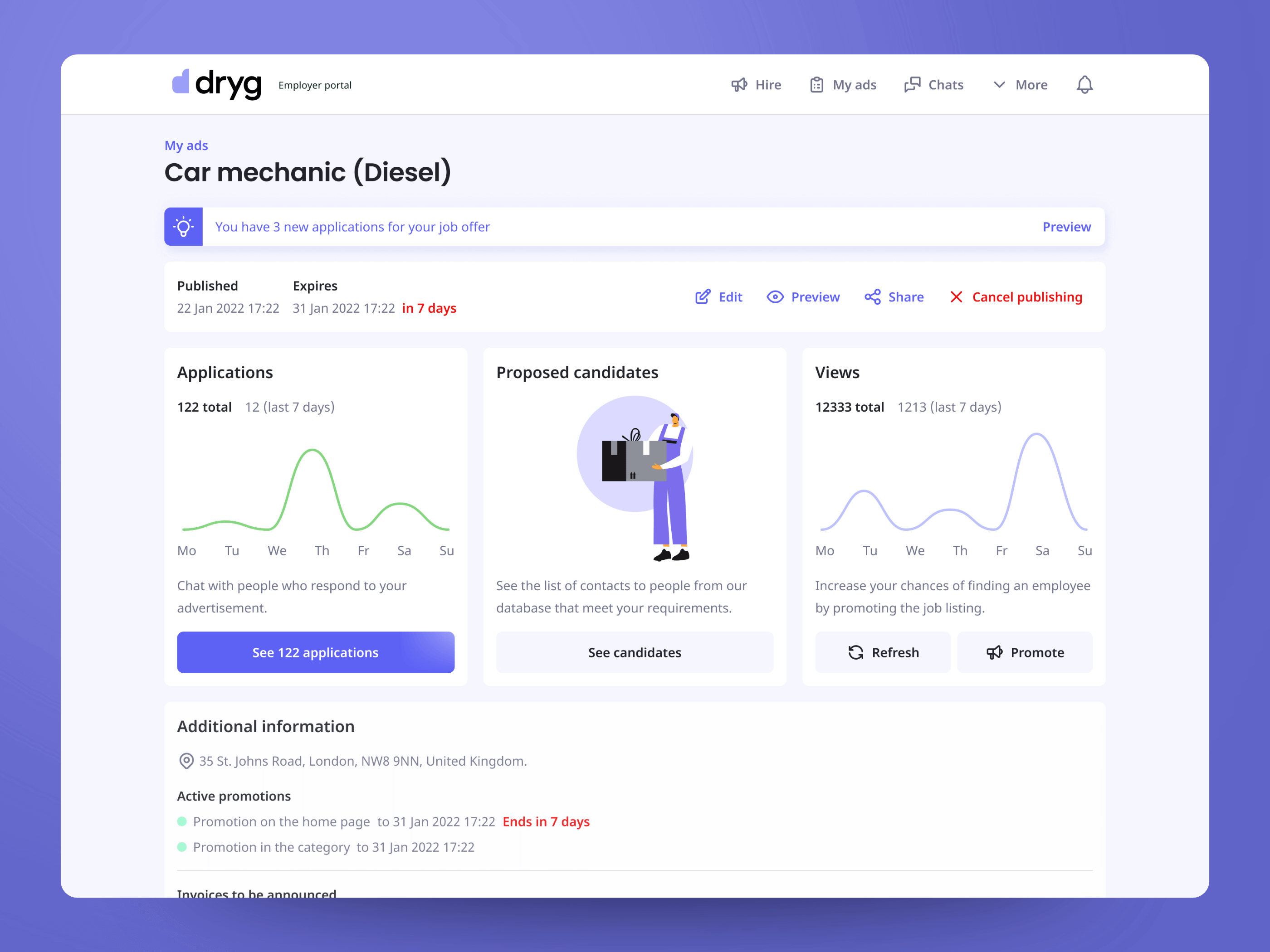
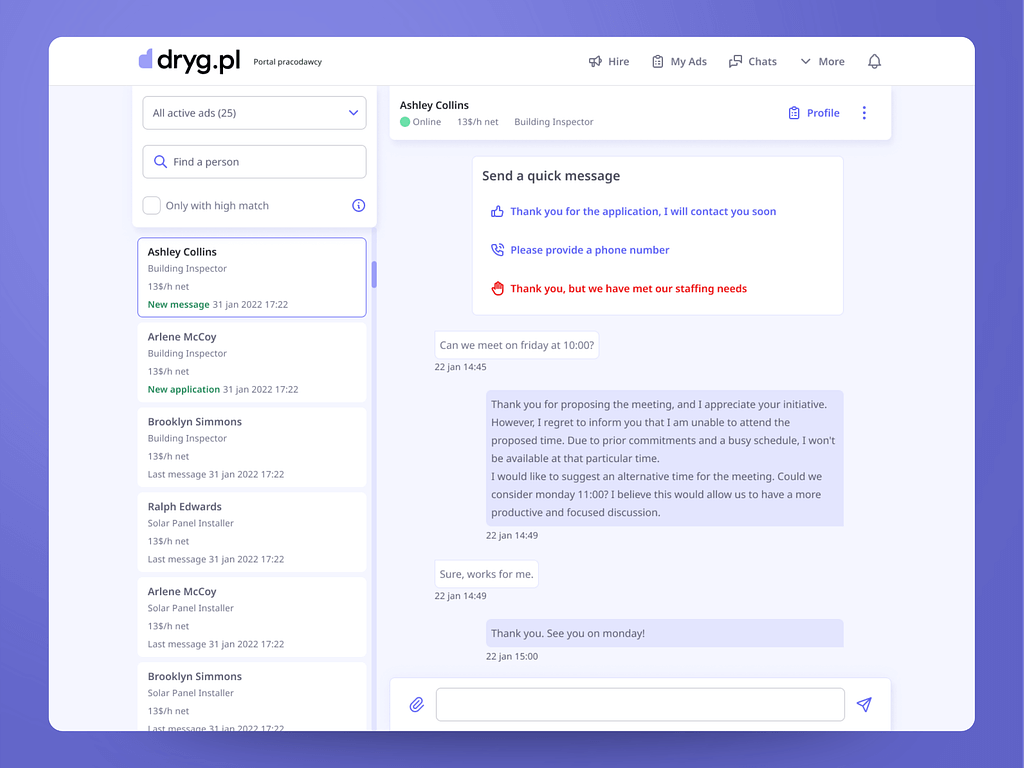
Cleared up user flows and distinguished job-seeker vs employer-ATS paths — a new main navigation and a login page that shows which part of the platform you enter.
Better job-listing behavior — infinite scroll replaced pagination; returning from an offer restores scroll position and filters (a huge frustration before).
Larger trigger areas — bigger buttons and inputs made the platform more forgiving and accessible.
Faster task completion — redundant steps removed (within code architecture limits); reaching critical actions like “apply” takes noticeably less effort.
Edge case coverage — e.g. expired job links now explain the situation and show similar offers from the same category instead of dead-ending.
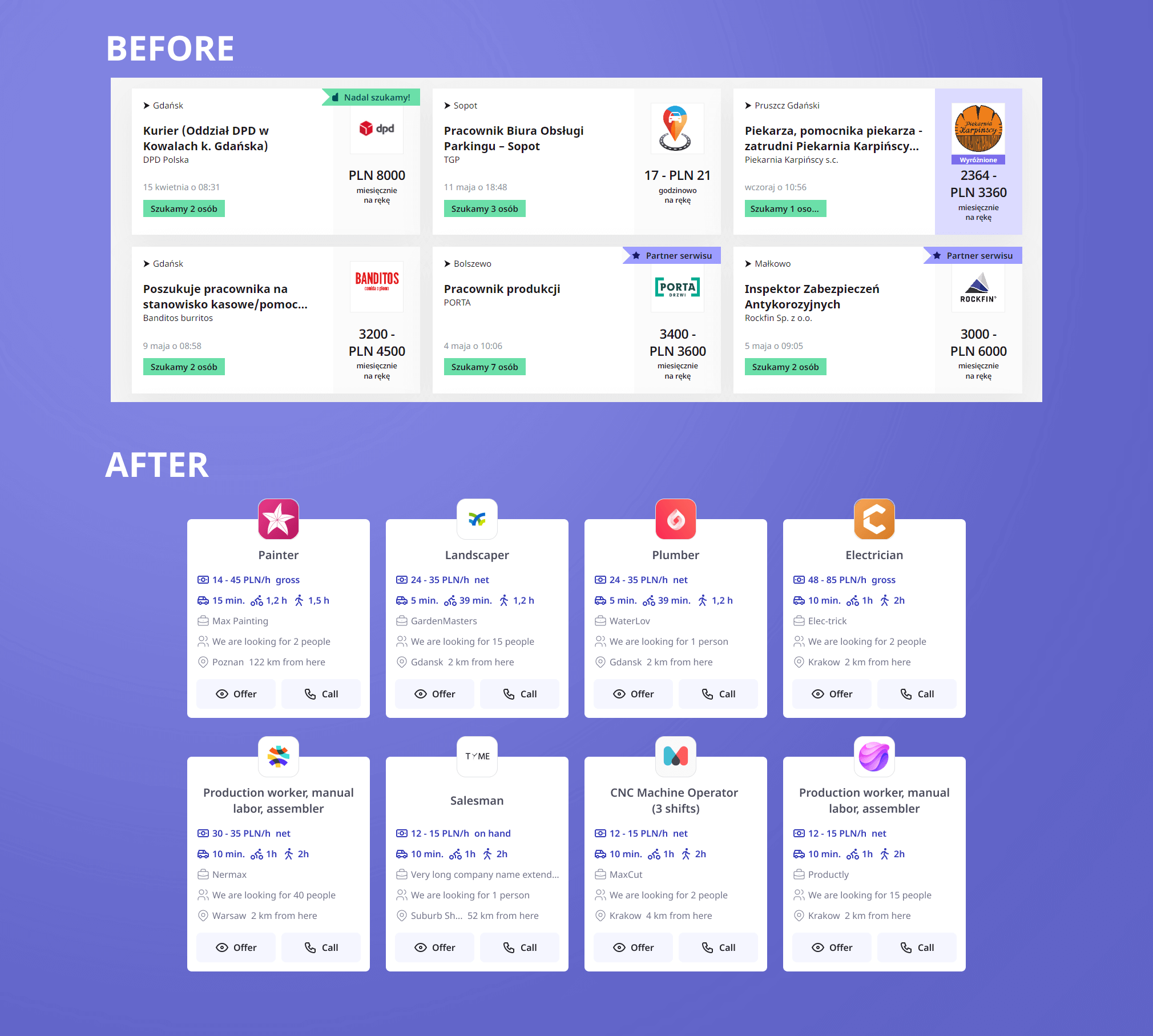
Effects
Improved design ↔ development workflow — faster, less assistance needed, higher delivery quality.
Inconsistencies removed from the design system, improving the product’s general aesthetics.
A single design file with all necessary information improved information flow across the team.
UX improvements also increased job applications per user and other KPIs.
- 3.6 → 4.5App rating after 3 months
- 4pxSpacing system unifying web & mobile UI
- 1Collaborative file: styleguide, components, wireframes, prototype
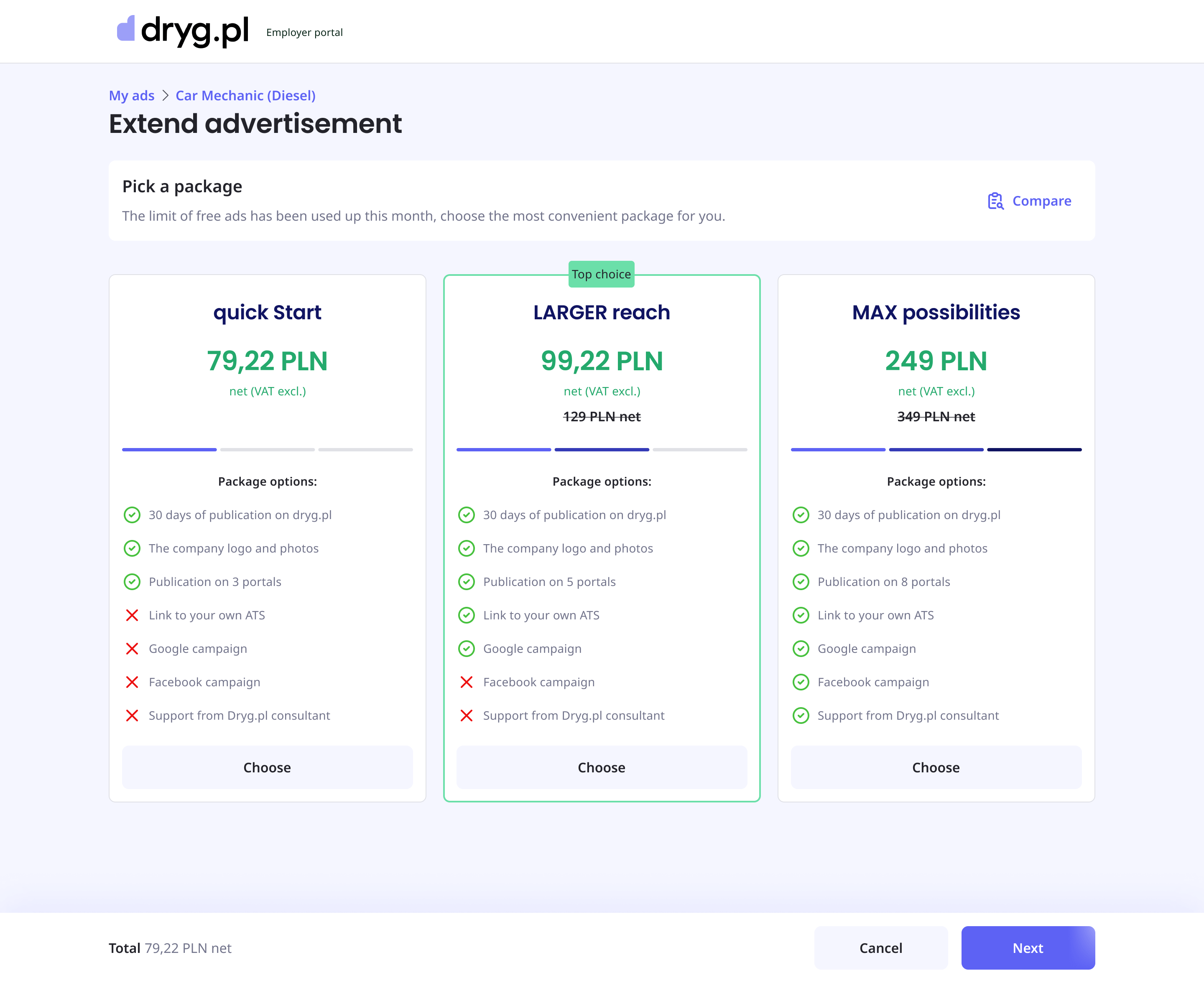
There’s more when we meet.Drop me a hint what your needs are.
Tell me about your product, your users and the problem that keeps you up at night. I usually reply within 48 hours.
marek@makeux.pl